Describing and Visualizing Data
This week we are focusing our attention on how to describe and visualize data. In the first homework assignment, you gained some experience running both basic descriptive statistics and basic visualizations of the data (box plots and histograms). The focus of last week’s lab and homework was primarily on becoming comfortable working with R and RStudio. This week, we will continue to build your comfort and experience with R while also developing your conceptual understanding of how to describe and visualize data.
Cleaning and Screening Data
Before we dive into central tendency and variability, we need to do one of the most important steps in data analysis–cleaning and screening the data. We will use the mtcars dataset which is a builtin dataset in R. The data in mtcars were extracted from the 1974 Motor Trend US magazine, and comprises fuel consumption and 10 aspects of automobile design and performance for 32 automobiles (1973–74 models).
data(mtcars)
str(mtcars)
The dplyr Package
We’ll use the package dplyr for cleaning and screening the data. The dplyr package contains functions for a variety of data cleaning verbs (this is just a short list of some of the ones we will use this semester):
dplyr function |
What it Does |
|---|---|
filter() |
selects cases |
mutate() |
create or change a variable |
rename() |
rename a variable |
arrange() |
sort a column |
select() |
select variables |
summarize() |
prints summary statistics for a variable |
group_by() |
group a dataset by a factor/categorical variable |
There are continuous and categorical variables in the dataset. However, the categorical variables are all listed as numeric. We will need to tell R to treat those variables as factors (this will help when we want to graph things later!). Before we jump into factoring variables, let’s take a quick detour to learn about “the pipe.”
Introducing the pipe: %>%
Often when we are cleaning data, we may want to string several functions together. For example, we may want to create a variable, filter out some of the data, then save a subset of the variables into a smaller dataframe. In Base R, you can nest the different functions inside one another. A great example of how the pipe works comes from Twitter user (@andrewheiss):
Take the following series of actions: waking up, getting out of bed, getting dressed and then leaving the house. Imagining these were functions in R, you could string them altogether like this:
leave_house(get_dressed(get_out_of_bed(wake_up(me))))
While some people may not find that hard to follow, I do! The “pipe” simplifies the structure of these nested function. Think of the pipe as the word “then”. You can use the %>% to connect a series of functions. So:
leave_house(get_dressed(get_out_of_bed(wake_up(me))))
becomes:
me %>%
  wake_up %>%
  get_out_of_bed %>%
  get_dressed %>%
  leave_house
Now that we know how the pipe works, let’s use it when we write the code to factor variables. Convert the cyl, vs, and am variables to factors using the mutate function. Remember: Think of the pipe as the word “then” and is represented by the %>% symbol.
library(dplyr)

#the code below will convert the cyl, vs, and am variables to factor variables with labels.
mtcars <- mtcars %>%
  mutate(cyl= factor(cyl,
                     levels = c(4, 6, 8),
                     labels = c("4 cyl", "6 cyl", "8 cyl")),
        vs = factor(vs,
                     levels = c("0", "1"),
                     labels = c("v-shaped", "straight")),
        am = factor(am,
                    levels = c("0","1"),
                    labels = c("automatic", "manual")))

table(mtcars$cyl)
Once you are confident that are all the variables have the correct structure, move on to examining whether the data are accurate. Often when data is entered by hand (or even when done by computer!) there can be data entry errors. Use the summary function in Base R to get some basic statistics about the sample. Make sure that all the values for each variable make sense. There is no missing data in this dataset, and all of the values appear to be within range. This won’t always be the case. Later on, we’ll learn how to identify and remove outliers and examine the normality of the data.
summary(mtcars)
Filtering cases
If you plan to compare groups, or focus your analyses on only a subset of the participants, the filter function will come in handy. We can make a dataset that only contains cars with automatic transmissions. We need to use a double equal sign, ==, instead of a single one, =. Logical statements in R require ==. You could also use > < >= <= & (and), | (which means “or”).
autotransmission <- dplyr::filter(mtcars, am == "automatic")
A new dataframe should appear in your environment called autotransmission.
We could have used the pipe, %>% here, too.
autotransmission <- mtcars %>%
  dplyr::filter(am == "automatic")
Of course, there is a lot more to data cleaning and screening. In addition to examining accuracy, we also want to develop a sense of the center, spread, and shape of our data, which is the focus of the next section.
Describing Data: Center, Spread, and Shape
There are three ways we can describe data: we can examine the center, spread, and shape of a distribution. Let’s start with the center.
Central Tendency: Mean, Median, Mode
Mean. The mean of a distribution of scores represents the average of those scores. To calculate the mean of variable X, you sum all of the the x-values and divide by the total number of participants or data points (n).
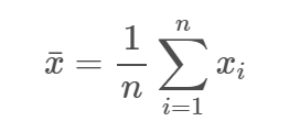
One problem with the mean is that it can be strongly affected by the presence of outliers, or when there is a lot of skewness (asymmetry) in the dataset. Additionally, the mean can only be used when the data are interval or ratio.
Median. The median is the score that occurs at the 50% percentile of a distribution. In other words, the median splits the distribution in half–half of the scores are below the median, and half are above it.
Mode. The mode is the score in a dataset that occurs most frequently. When looking at a frequency histogram, the largest column represents the mode.
When should you use the mean versus median versus the mode?
In general, the mean is used most often to describe the central tendency of a distribution. It is a good choice because it uses all of the numbers in a distribution, is related to measures of variance (which we will discuss shortly), and can be used for both interval and ratio type data.
The mode should be used when you have categorical or nominal data. It can also be used if you just need a quick estimate.
The median should be used when the data are skewed.
- Why is the median better than the mean when the distribution is skewed?
Variability
Variability is a quantitative measure of the degree to which scores in a distribution are spread out. It is one of the most (if not the most) important concepts we will cover this semester because it is at the heart of nearly every statistical test you will learn over the next two semesters.
There are two common measures of variability:
Range. The range is calculated by subtracting the minimum value in a dataset from the maximum value. In other words, it is the distance between the largest and the smallest values in a dataset.
The range is susceptible to extreme scores, so it is better to use the Interquartile Range or IQR . The IQR provides the range of the middle 50% of the distribution and is not vulnerable to to extreme scores. THe IQR is calculated by subtracting the score at the 25th percentile from the score at the 75th percentile.
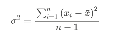
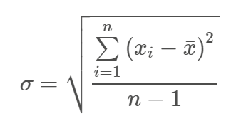
Standard Deviation. The standard deviation represents the average distance scores fall from the mean of a distribution. To calculate the SD, you first calculate the mean and then subtract it from each score in the distribution, creating deviation scores (column 2 in the table below). Then you square those values (see the third column in the table below).
The sum of the squared deviation scores is called the sum of squares. When you divide the SS by N-1, you get the variance. The square root of the variance is the standard deviation.
The formula for the variance is:
And the formula for the standard deviation is:
Those scary equations make calculating the variance and standard deviation look a lot more complicated than it is. The table below illustrates the calculation of the SS, variance, and SD. Important note: the variance of a population is referred to as sigma and the SD as sigma-squared.
| X | Deviation Scores ` |
Squared Deviation Scores ` |
|---|---|---|
| 3 | -3 | 9 |
| 5 | -1 | 1 |
| 6 | 0 | 0 |
| 7 | 1 | 1 |
| 9 | 3 | 9 |
| Sum | 0 | 20 |
To calculate the sum of squares (SS), we sum all of the values in the 3rd column, SS = 20.
The variance is SS/N-1 = 20⁄4 = 5
The SD is square root of the variance, 2.24.
We can double-check our math using R:
#Create a vector with our data
sample_data <- c(3,5,6,7,9)

#calculate the variance and standard deviation of the data
var(sample_data)
## [1] 5
sd(sample_data)
## [1] 2.236068
Characteristics of the Mean and Standard Deviation
We created a vector called sample_data that contains a set of five scores. We are now going to use that vector to explore the characteristics of the mean and standard deviation.
- What happens to the mean and standard deviation when you multiple each score in a dataset by a constant?
- What happens to the mean and standard deviation when you add (or substract) a constant from each score in the dataset?
- What happens to the mean and standard deviation when you change a score?
The code below will get you started:
#creating a new object where each score in sample_data is multiplied by 2
sample_data
sample_data_times2 = (sample_data)*2
sample_data
sample_data_times2          #will display the vector created in the line above
mean(sample_data)           #display the mean of sample_data
mean(sample_data_times2)    #display the mean of sample_data_times2
sd(sample_data)             #display the SD for sample_data
sd(sample_data_times2)      #display the SD for sample_data_times2


sample_data
sample_data_plus3 = (sample_data)+3
sample_data
sample_data_plus3
mean(sample_data)           #display the mean of sample_data
mean(sample_data_plus3)
sd(sample_data)
sd(sample_data_plus3)


sample_data_changed <- c(3,5,6,7,10)
mean(sample_data_changed)
sd(sample_data_changed)
Using mosaic to calculate descriptive statistics
So far, when we have calculated descriptive statistics for a set of numbers we have used functions in Base R. And while Base R can do a lot of what we need, sometimes there are packages that do things better or faster, or in a way that is more intuitive. The mosaic package was developed by statistics and mathematics instructors to facilitate statistical learning using R. Load the mosaic package using the library function.
library(mosaic)
The function favstats() will give descriptive statistics for a numerical variable, and the function tally() will give you frequencies for categorical variables. Functions in mosaic use formula syntax, where y ~ x, or for a single variable, ~x.
The first argument is the formula, and the second argument is the data frame, e.g., data = mtcars.
Calculate descriptive statistics for mpg using favstats and calculate the frequency of transmission type using tally.
favstats(~mpg, data = mtcars)

tally(~am, data=mtcars)
It is often useful to look at descriptive statistics broken down by a grouping variable. Let’s look at the average miles per gallon for both automatic and manual tranmission cars. You can read the formula syntax below as “mpg as a function of transmission type”.
favstats(mpg~am, data=mtcars)
Note that base R and mosaic do not give you the mode in the summary statistics because there is no mode function in either of those packages. To determine the mode, you can put the values for a variable into a table, and see which value has the highest frequency.
table(mtcars$hp)
In this example, there are several modes–110, 175, and 180 all appear three times in the dataset.
Summary statistics do a good job of helping us understand the center and spread of a distribution. But what about shape? In order to determine the shape of a distribution, we need to see it graphically. Graphing the data can also provide information about the center and shape that you may not have inferred from just looking at the statistics.
Always graph your data!
Graphing Data
In just the first two weeks of this course, you have already used some of the functions in Base R to create graphical representations of the data. For example, you have used thehist and boxplot functions. Base R is great when you need just a quick visual of the data. But it is limited when you need graph something more complex than a histogram or boxplot. Luckily, there is a package we can use that will meet all of our graphing needs–ggplot2.
Why ggplot2?
The “gg” in ggplot2 stands for the “grammar of graphics”. The advantages of ggplot2 are:
- consistent underlying
grammar of graphics(Wilkinson, 2005) - plot specification at a high level of abstraction
- very flexible
- theme system for polishing plot appearance
- mature and complete graphics system
- many users, active mailing list
What Is The Grammar Of Graphics?
The basic idea: independently specify plot building blocks and combine them to create just about any kind of graphical display you want. Building blocks of a graph include:
- data
- aesthetic mapping
- geometric object
- statistical transformations
- scales
- coordinate system
- position adjustments
- faceting
Helpful link: The R Cookbook
ggplot2 v. Base Graphics
Compared to base graphics, ggplot2
- is more verbose for simple / canned graphics
- is less verbose for complex / custom graphics
- does not have methods (data should always be in a
data.frame) - uses a different system for adding plot elements
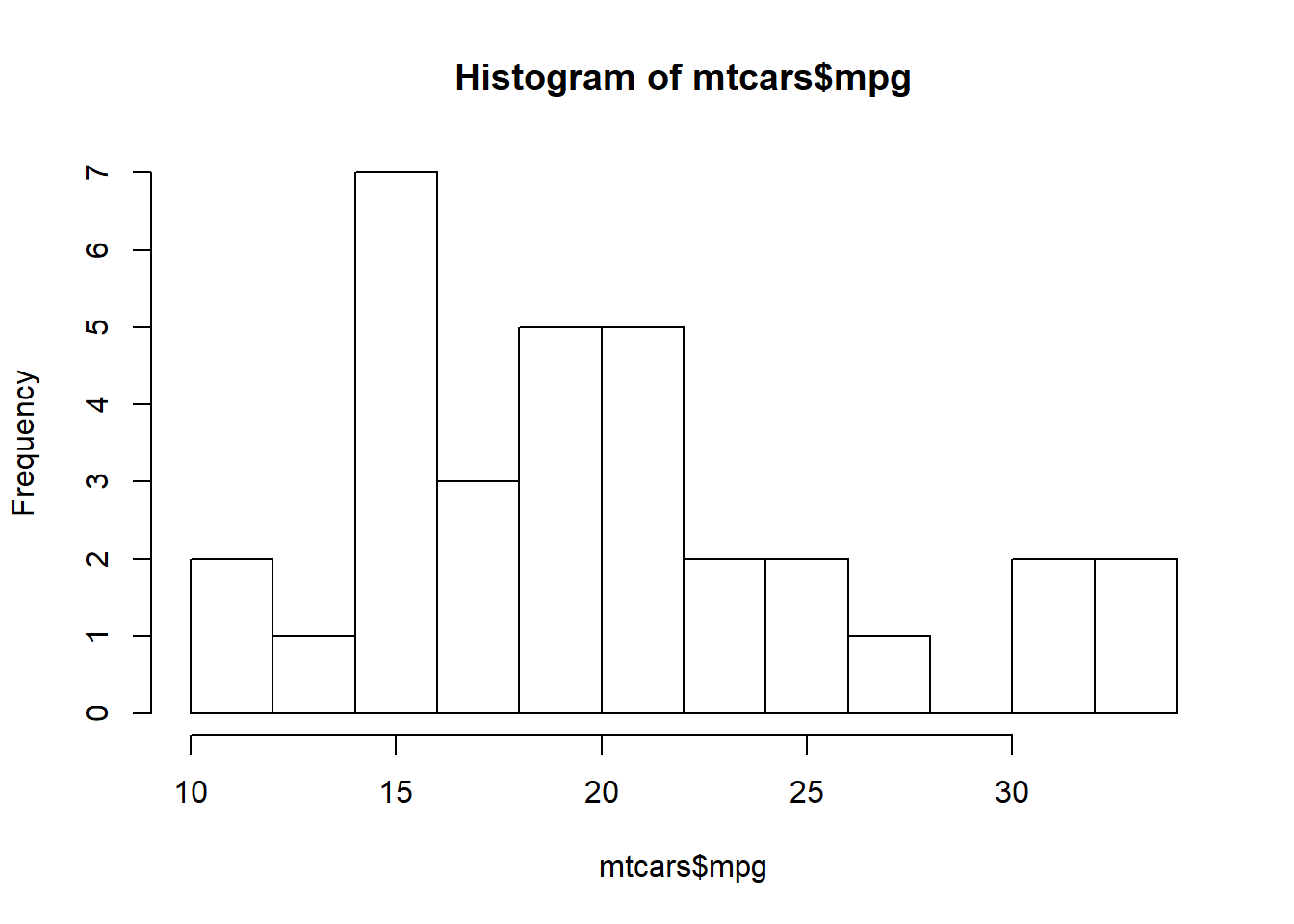
Base graphics histogram example:
hist(mtcars$mpg, breaks=10)
ggplot2 histogram example:
library(ggplot2)
ggplot(mtcars, aes(x = mpg)) +
  geom_histogram(bins = 10)
You can see that the code required for the Base R version of the histogram is just one line, while the code the ggplot is 2 lines. ggplot2 code is going to be longer because you have a great deal of flexibility with how you build the graph.
Here is another example:
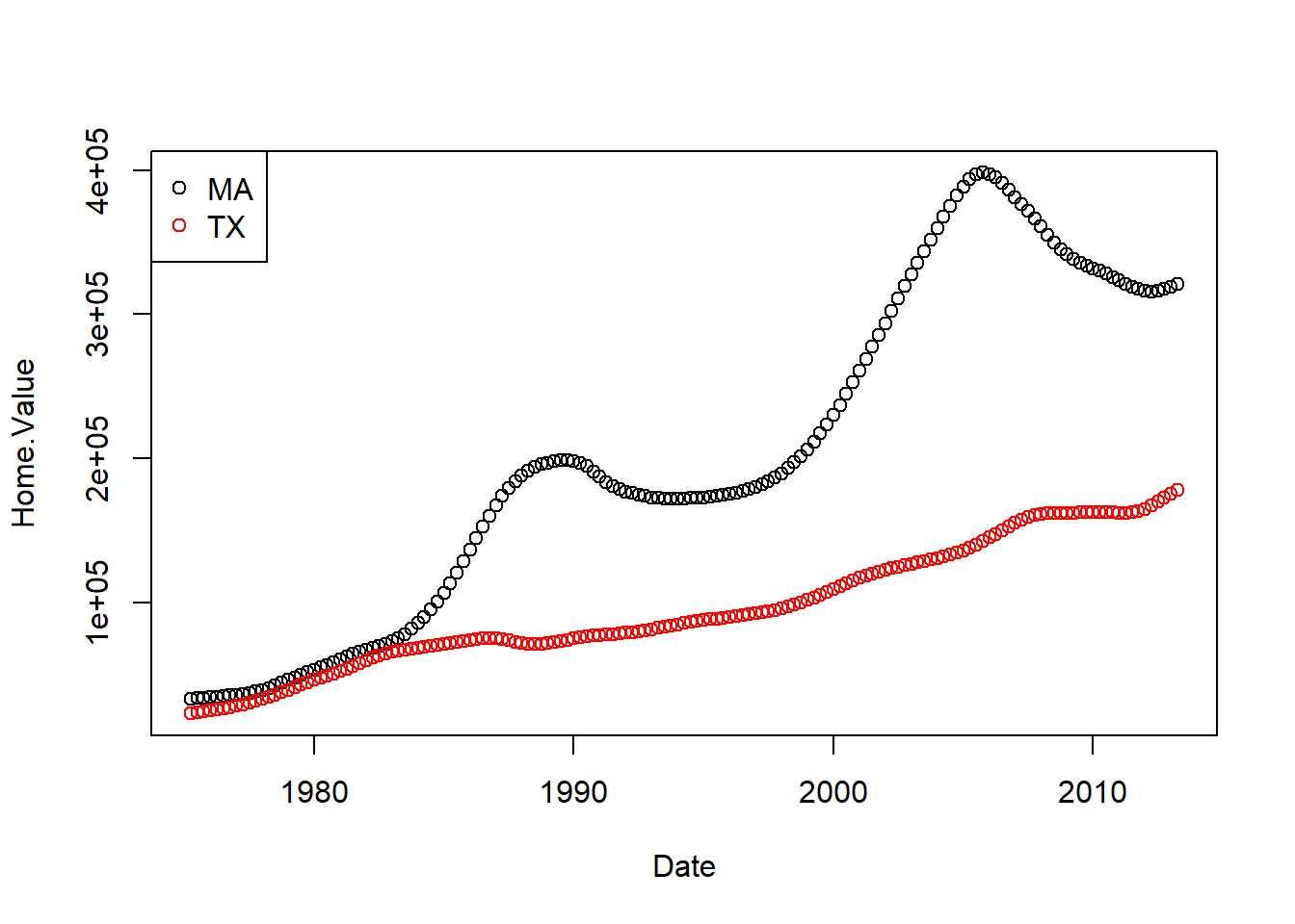
Base graphics colored scatter plot example:
plot(Home.Value ~ Date,
     col = factor(State),
     data = filter(housing, State %in% c("MA", "TX")))
legend("topleft",
       legend = c("MA", "TX"),
       col = c("black", "red"),
       pch = 1)
ggplot2 colored scatter plot example:
library(ggplot2)
ggplot(filter(housing, State %in% c("MA", "TX")),
       aes(x=Date,
           y=Home.Value,
           color=State))+
  geom_point()
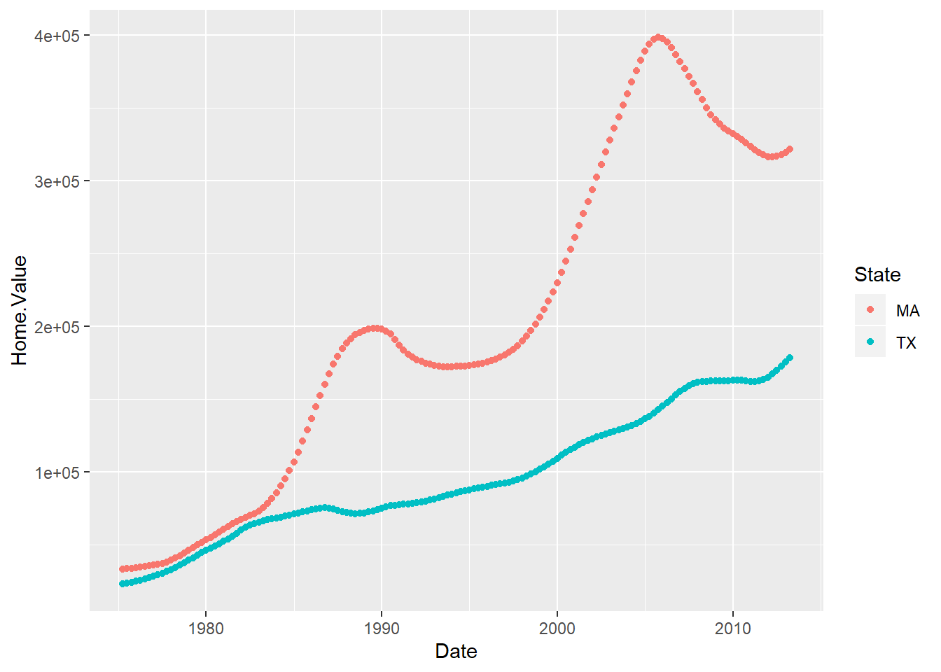
Overall, ggplot2 does a better job with more complex, publication-quality plots. The downside of ggplot2 is that because it is so powerful, it can tricky to figure out how to get exactly what you want. Luckily, there are TONS of resources on the Internet if you get stuck. It may be helpful as you are learning ggplot2 to use the # to make notes to yourself on each line of code for a graph so that you can remember why you set it up that way.
Important tip: Stack your code!
The Building Blocks of ggplot2
Aesthetic Mapping
In ggplot land aesthetic means “something you can see”. Examples include:
- position (i.e., on the x and y axes)
- color (“outside” color)
- fill (“inside” color)
- shape (of points)
- linetype
- size
Each type of geom accepts only a subset of all aesthetics. Refer to the geom help pages to see what mappings each geom accepts. Aesthetic mappings are set with the aes() function.
Geometic Objects (geom)
Geometric objects are the actual marks we put on a plot. Examples include:
- points (
geom_point, for scatter plots, dot plots, etc) - lines (
geom_line, for time series, trend lines, etc) - boxplot (
geom_boxplot, for, well, boxplots!)
A plot must have at least one geom; there is no upper limit. You can add a geom to a plot using the + operator.
Quick Plots with ggplot2
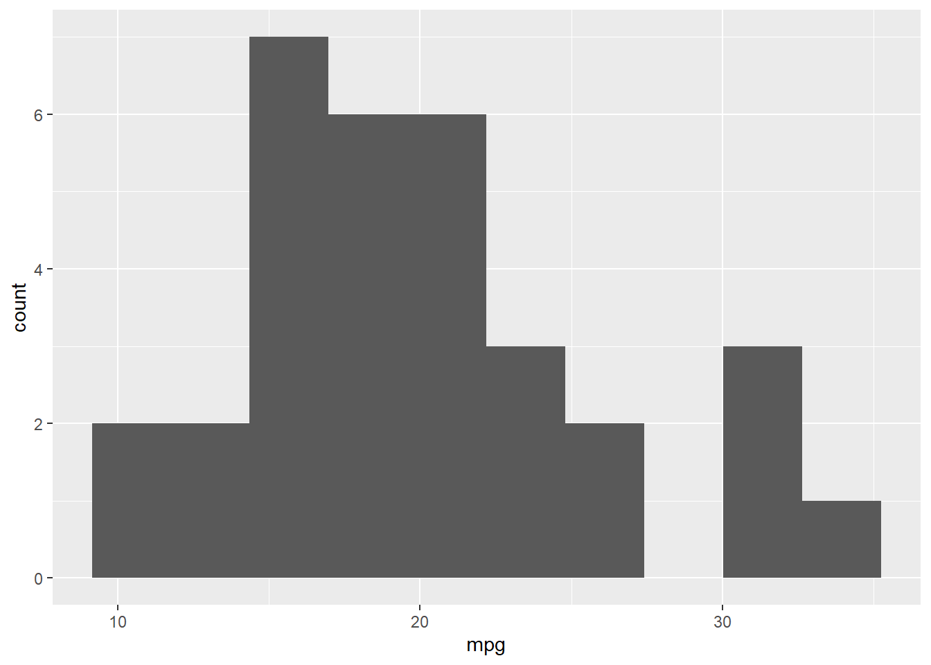
The easiest way to make a plot with ggplot is to use the “quick plot” function (qplot). When there is only variable included in the code, qplot will guess which type of plot you want based on the variable type. The code below will create a histogram for the mpg variable in the mtcars dataset. In this example, the plot is saved to an object called “mpg_histogram”. When you save a plot to an object, nothing will happe when you run the code. You need to call the plot (the second line of code) for it to appear.
The number of bins is set to 15, but you can (and should) play around with this number.
mpg_histogram <- qplot(mpg, data = mtcars, bins = 10)
mpg_histogram    #call the plot

#add labels to the x and y axes
mpg_histogram +
  xlab("miles per gallon") +
  ylab("frequency")
Now let’s see if the histograms look different for automatic versus manual tranmission. We can do that by mapping the am variable to the fill aesthetic.
qplot(x = mpg, fill = am, data = mtcars, bins = 10)
Density plots
We could also use a density plot here instead. Density plots display a smoothed distribution and the area under the curve always sums to 1. They are useful when comparing distributions with different *n*s. For this example, we need to set a geom so that R knows we want a density plot. We can use alpha to set the transparency of the graph.
qplot_mpg <- qplot(x = mpg, fill = am, alpha= .15, data = mtcars, geom = "density")
qplot_mpg
The default colors in ggplot are….ugly. To change them, we can use scale_fill_manual (“fill” because in the plot above we used fill=am) Because I saved the plot to an object above, I can just add a layer to it where we override the default colors.
qplot_mpg +
  scale_fill_manual(values = c("purple","deepskyblue3"))
Boxplots using qplot
qplot can also be used for boxplots. When you have a categorical (factor) variable, you can use that to split the boxplot by that factor variable. To get a boxplot, you need to set the geom using geom=boxplot.
boxplot_am <- qplot(y = mpg, x = am, fill = am, color = am, data = mtcars, geom = "boxplot") + scale_color_manual(values = c("red","blue"))
boxplot_am
Bar Charts: One IV
One graph we will use repeatedly throughout this semester will be a bar chart. Bar charts are used to display the means and confidence intervals (what are those?) for the groups you are comparing on a particular variable. For these bar chart examples, we will use one of the datasets from Andy Field (chickFlick.csv). You can access the data from the website for the textbook, Discovering Statistics using R. Or, you can access it here:
In this dataset, there are two independent variables (Film and Gender) and the dependent variable is arousal scores.
chick = read.csv("ChickFlick.csv", fileEncoding="UTF-8-BOM")
First, let’s create a bar plot for one independent variable. In this case, we are interested in examining the mean differences in arousal ratings for Bridget Jones’ Diary versus Memento. To graph the mean, we need to use stat_summary and set the function of y to mean. The second stat_summary adds the confidence intervals for the mean. We will talk about CIs more next week.
library(Hmisc)
chickbar <- ggplot(chick, aes(x = film, y = arousal))
chickbar

chickbar <- chickbar +
  stat_summary(fun.y = mean,
               geom = "bar",
               fill = "dark grey",
               color = "Black") +
  stat_summary(fun.data = mean_cl_normal,
               geom = "errorbar",
               width = .2,
               position = "dodge")  +
  xlab("Movie Watched by Participants") +
  ylab("Arousal Level") +
  scale_x_discrete(labels = c("Girl Film", "Guy Film"))

chickbar
While this graph looks pretty good, it is still not in publishable form. We need to get rid of the gray background and add axis lines. The code below will clean up the graph. Because we are storing the clean up actions in an object, once we run it once during a R session, we can use in all of our graphs just by including cleanup. This code was written by Erin Buchanan [http://statstools.com/]
cleanup = theme(panel.grid.major = element_blank(),
                panel.grid.minor = element_blank(),
                panel.background = element_blank(),
                axis.line.x = element_line(color = "black"),
                axis.line.y = element_line(color = "black"),
                legend.key = element_rect(fill = "white"),
                text = element_text(size = 15))

chickbar + cleanup +
  ggtitle("My First Plot")
Bar Charts with 2 IVs
Now that we have created a bar chart for one independent variable, we can extend that to when we have two IVs. With the ChickFlick dataset, we can examine mean differences by both film and gender. We will set up the plot much like we did the previous example. However, this time, we will use fill=gender to plot our second IV.
chickbar2 <- ggplot(chick, aes(x = film, y = arousal, fill = gender))
chickbar2 +
  stat_summary(fun.y = mean,
               geom = "bar",
               position = "dodge") +
  stat_summary(fun.data = mean_cl_normal,
               geom = "errorbar",
               position = position_dodge(width = 0.90),
               width = .2) +
  xlab("Film Watched") +
  ylab("Arousal Level") +
  cleanup +
  scale_fill_manual(name = "Gender of Participant",
                    labels = c("Boys", "Girls"),
                    values = c("gray36", "gray63"))
More on Histograms
Earlier, we created histograms using Base R and qplot from ggplot2. We can also create a histogram using the full features of ggplot2. In the histogram below, we use geom_histogram to tell ggplot2 what kind of graph we want. Again, you can play around with the number of bins to determine the best number for your data.
ggplot(chick, aes(x = arousal, fill = gender)) +
  geom_histogram(bins = 10) +
    scale_fill_manual(values = c("red", "blue")) +
  cleanup
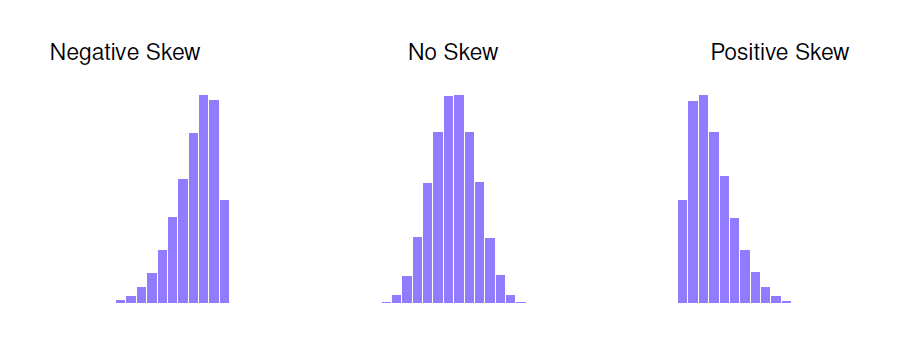
Histograms are important because they allow us to see the shape of the data. In particular, histograms are useful for assessing the skewness and kurtosis of a distribution.
Skew: A measure of asymmetry. Skewness deals with where the tail of a distribution lies. A positively skewed distribution has a tail going to the right. A negatively skewed distribution has a tail going to the left.
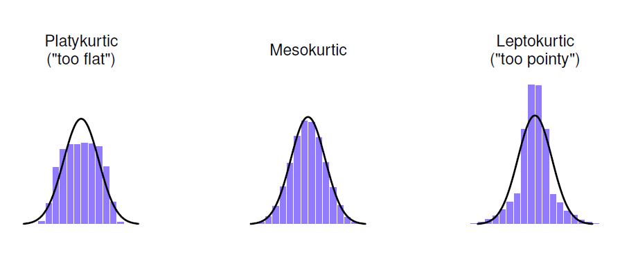
Kurtosis: Kurtosis deals with how flat or pointy a distribution is. Distributions that are flat are said to be platykurtic. Distributions that are too skinny or pointy are called leptokurtic. The normal distriubtion has a kurtosis of value of 0 (it is neither too flat or too skinny).
It is also possible to get numeric values for skew and kurtosis. To do so in R, use the psych package. You can use the skewness and kutosi functions to then get numeric values for skew and kurtosis. You can also use the describe function, which will display descriptive statistics including the skew and kurtosis.
library(psych)

skew(chick$arousal, na.rm = TRUE,type=3)
kurtosi(chick$arousal, na.rm = TRUE,type=3)

psych::describe(chick$arousal, na.rm=TRUE)
Layering
The last ggplot2 feature you’ll learn this week is layering geoms. For example, we can layer a density plot and a histogram using the code below. In this example, we build the density plot first. Then the histogram is added; however, instead of frequency on the y-axis, we set it to density. You can change the number of bins and colors as you wish. In this example, fill=NA so that the histogram is transparent. Try changing the fill color to see what happens.
ggplot(chick, aes(x=arousal)) +
  geom_density(color="blue")+
  geom_histogram(aes(y=..density..), bins=10, colour="black", fill=NA)