Correlation
For an initial introduction to calculating correlations in R, we will use the exam anxiety.csv dataset that is available at the DSUR Companion Website. You can also download a copy of the dataset here: Download Exam Anxiety Dataset
A psychologist was interested in the relationship between exam stress (anxiety) and revision on exam performance. State anxiety was measured on a 0-100 scale, revision was measured in hours (spent revising), and exam grade was the percentage grade students received on the exam.
Let’s load the data and save it to an object called exam.data. The run through your typical data cleaning/screening procedures to examine the data before moving to analysis.
exam.data <- read_csv("exam anxiety.csv")

exam.data <- exam.data %>%
  mutate(Gender = factor(Gender, levels= "Male", "Female"))
- Run basic descriptive statistics and visualizations of the variables in the data.
You should look at summary statistics, descriptive statistics, and histograms and/or boxplots:
summary(exam.data)
##        ID            Revise           Exam           Anxiety          Gender
##  Min.   :  1.0   Min.   : 0.00   Min.   :  2.00   Min.   : 0.056   Female:52
##  1st Qu.: 26.5   1st Qu.: 8.00   1st Qu.: 40.00   1st Qu.:69.775   NA's  :51
##  Median : 52.0   Median :15.00   Median : 60.00   Median :79.044
##  Mean   : 52.0   Mean   :19.85   Mean   : 56.57   Mean   :74.344
##  3rd Qu.: 77.5   3rd Qu.:23.50   3rd Qu.: 80.00   3rd Qu.:84.686
##  Max.   :103.0   Max.   :98.00   Max.   :100.00   Max.   :97.582
psych::describe(exam.data)
##         vars   n  mean    sd median trimmed   mad  min    max  range  skew
## ID         1 103 52.00 29.88  52.00   52.00 38.55 1.00 103.00 102.00  0.00
## Revise     2 103 19.85 18.16  15.00   16.70 11.86 0.00  98.00  98.00  1.95
## Exam       3 103 56.57 25.94  60.00   57.75 29.65 2.00 100.00  98.00 -0.36
## Anxiety    4 103 74.34 17.18  79.04   77.05 10.75 0.06  97.58  97.53 -1.95
## Gender*    5  52  1.00  0.00   1.00    1.00  0.00 1.00   1.00   0.00   NaN
##         kurtosis   se
## ID         -1.24 2.94
## Revise      4.34 1.79
## Exam       -0.91 2.56
## Anxiety     4.73 1.69
## Gender*      NaN 0.00
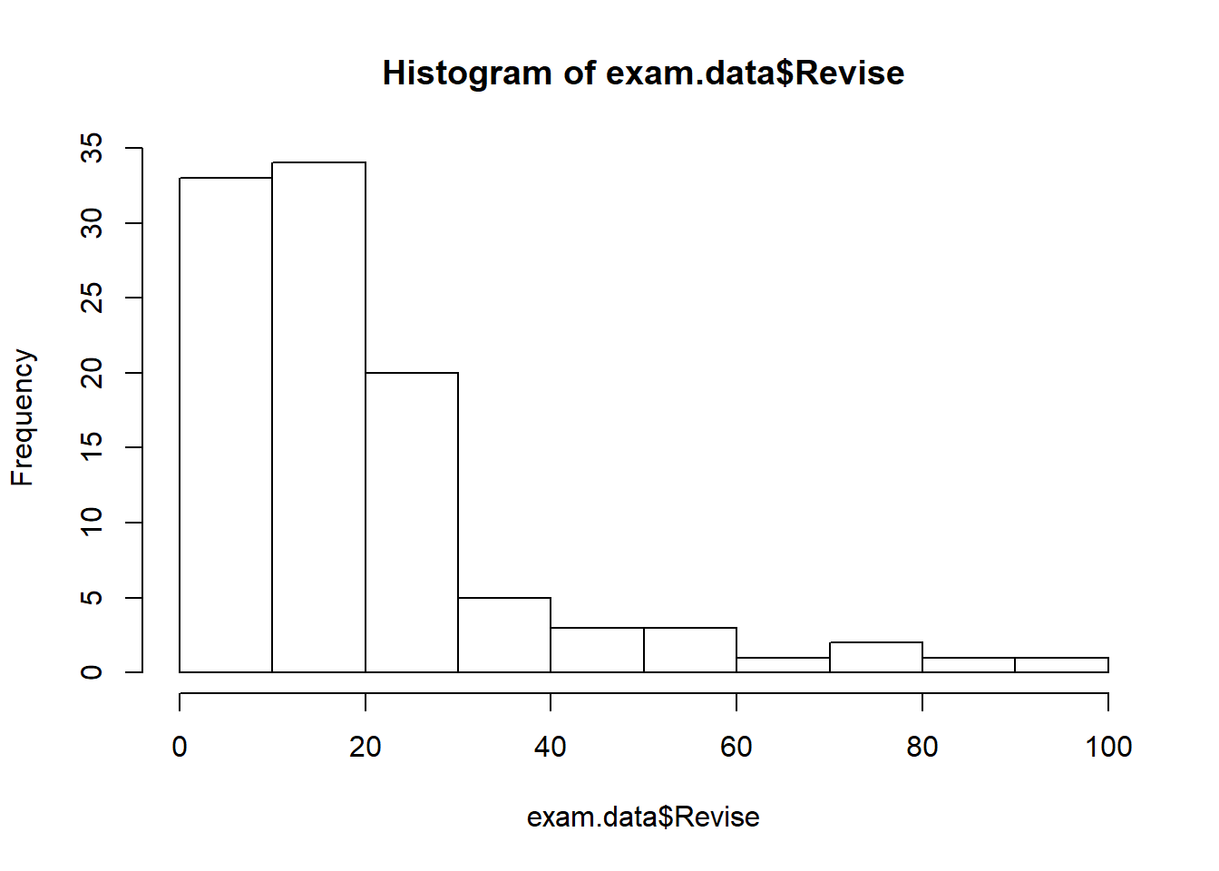
hist(exam.data$Revise)
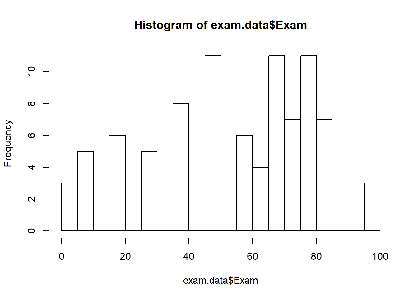
hist(exam.data$Exam, breaks=15)
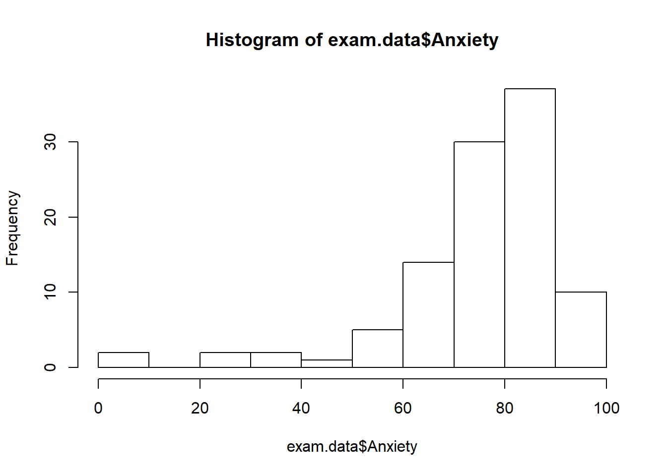
hist(exam.data$Anxiety)
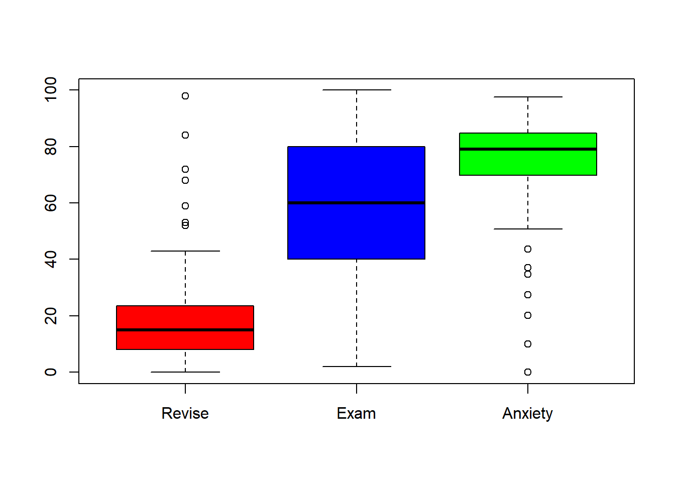
boxplot(exam.data$Revise,exam.data$Exam,exam.data$Anxiety, names = c("Revise", "Exam", "Anxiety"), col = c("red", "blue", "green"))
When you run correlations in R, all of the variables you want to correlate need to be in numeric format. Hopefully you’ve noticed that the Gender variable is a character variable. If we want to include gender in our correlation matrix, we would need to convert it to a numeric variable first. However, we are only interested in the correlations between exam, anxiety and revise.
- What are two different procedures you could use to temporarily remove
Genderfrom the dataset?
Visualizing Correlations: Scatterplots
Running and interpreting correlations should not be done without examining a graphical representation of the relationship. A scatterplot presents a visual representation of the relationship between two variables–usually a predictor variable (X-axis) and an outcome variable (Y-axis).
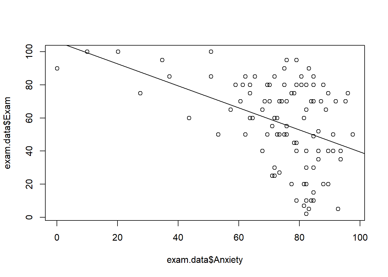
Base R has a plot function that will create a scatterplot. The format is plot(x, y):
#base R scatterplot
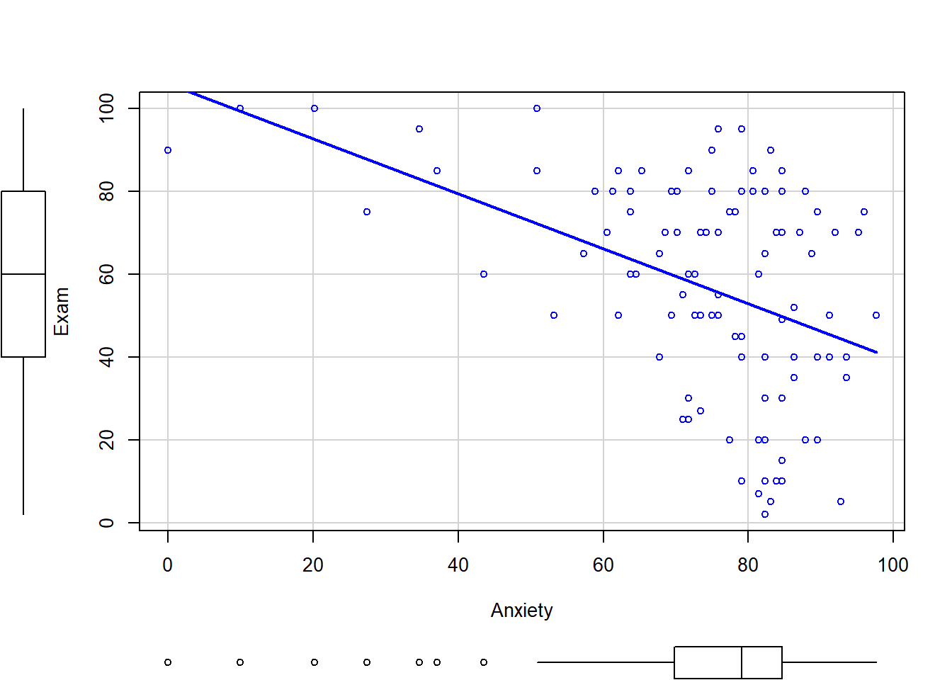
plot(exam.data$Anxiety, exam.data$Exam)
abline(lm(Exam~Anxiety, data=exam.data)) #adds the regression line
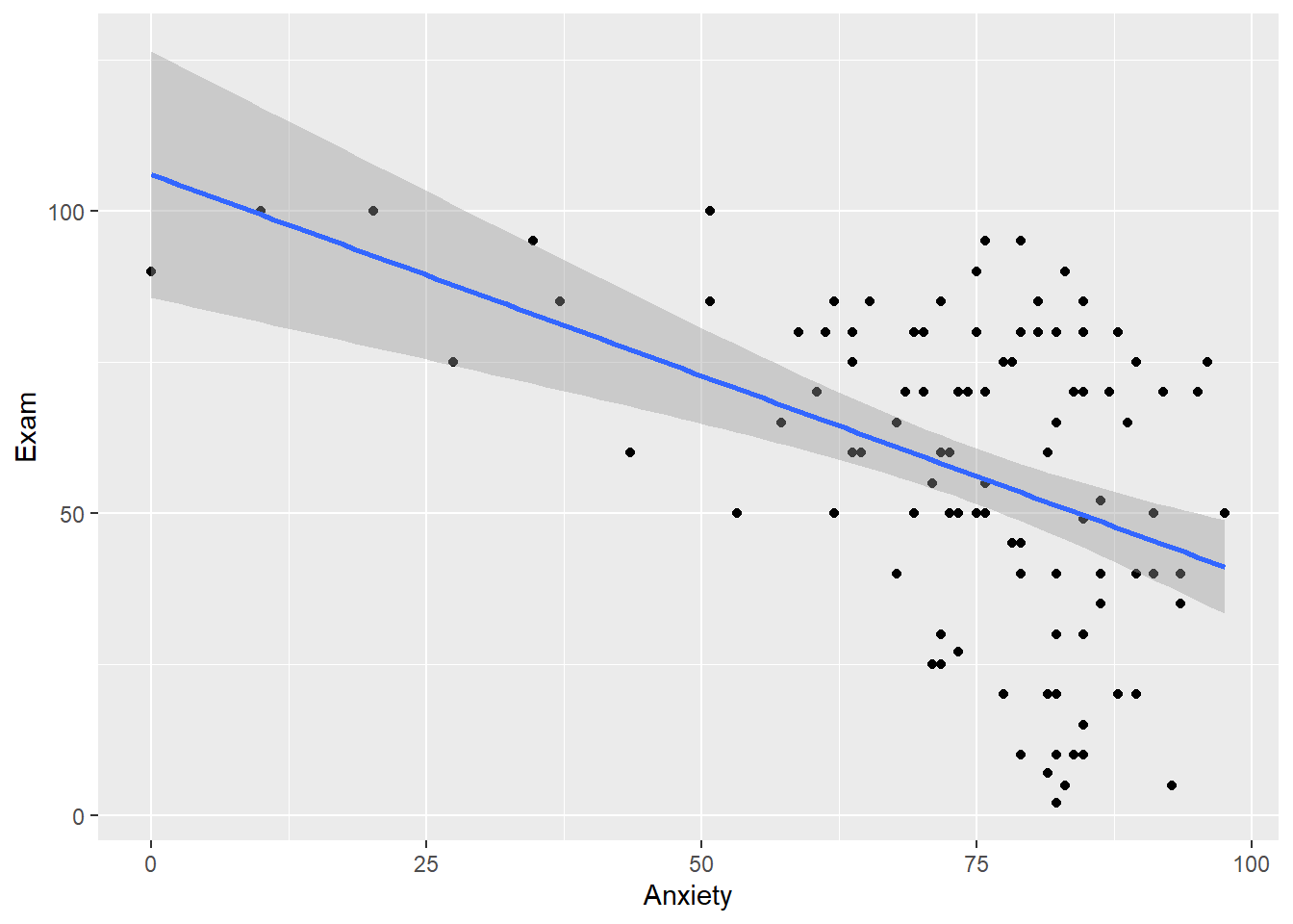
The ggplot2 package can be used to plot scatterplots, and we can build in additional layers to the plot just as we did with bar graphs and ANOVA. To plot a scatterplot, you will need to use geom_point. If you want to include the line of best fit, you can add geom_smooth(method = "lm"). By default, ggplot2 will plot the 95% confidence interval when using method="lm". If you want to turn this off, you can set se = 0.
#Exam with Anxiety
plot1 <- ggplot(exam.data, aes(x=Anxiety, y = Exam)) +
  geom_point() +
  geom_smooth(method="lm")
plot1
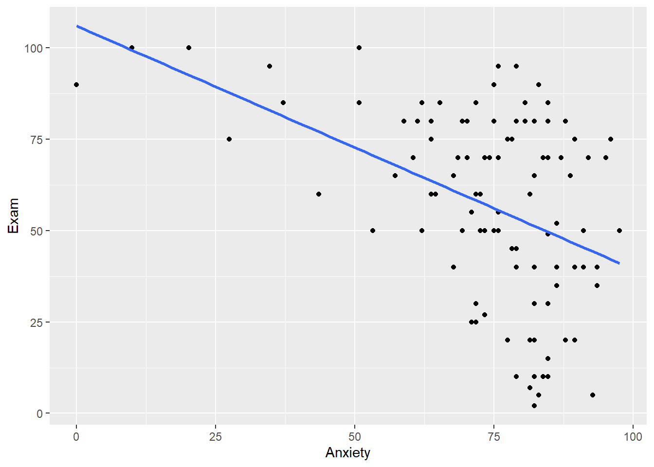
#Exam with anxiety without the 95$ CI
plot1a <- ggplot(exam.data, aes(x=Anxiety, y = Exam)) +
  geom_point() +
  geom_smooth(method="lm", se = 0)
plot1a
The car package also includes a scatterplot function that you can use. There are a number of features that you can turn on and off as you need (regression line, loess line, ellipses, axis labels, colors, boxplots, etc.) The documentation for the car package and the scatterplot function can be found here: car package
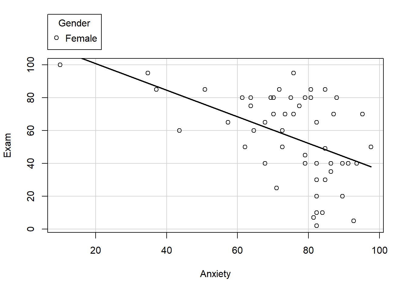
Below is a scatterplot of exam grades and anxiety by gender. Experiment with some of the options to see how the plot changes.
scatterplot(Exam~Anxiety | Gender, data=exam.data, smooth=FALSE, ellipse=FALSE, col=c("black", "blue"))
scatterplot(Exam~Anxiety, data=exam.data, smooth= FALSE, ellipse=FALSE)
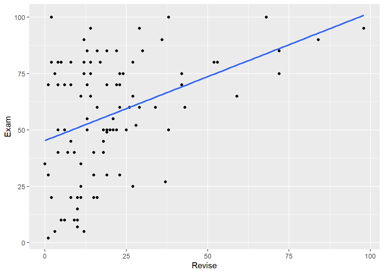
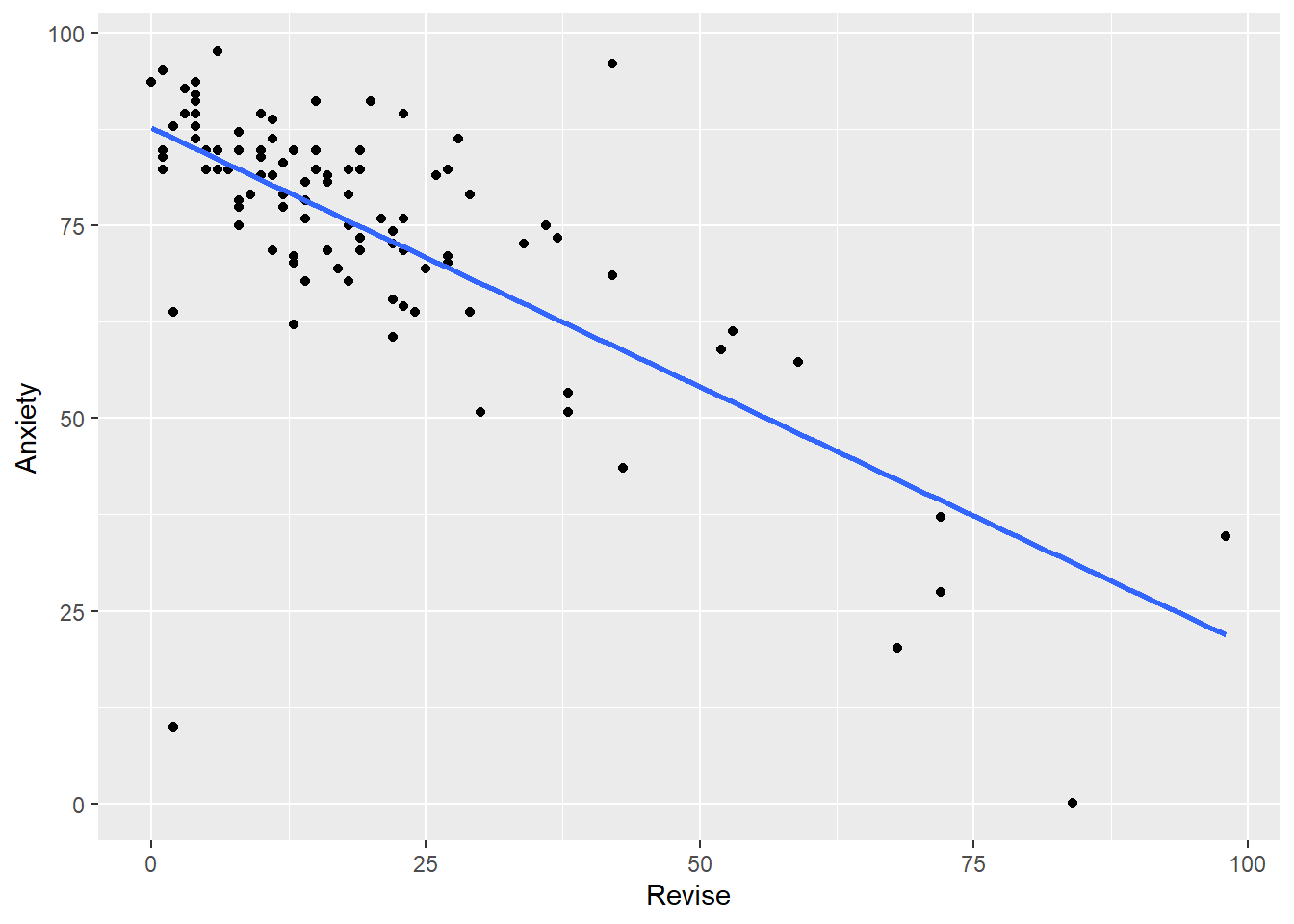
- Create scatterplots of Exam with Revise, and Anxiety with Revise.
Your scatterplots should look like this:
Running the Correlations
There are several different functions that can be used to run correlations in R. Some can run correlational analyses on all of the variables in a dataset, some can only do so on pairs of variables. Some provide p-values, others do not. Which function (or functions) you use will depend on your overall analysis goals. For example, if you are checking assumptions or relationship between variables before running analysis (as we did with repeated measures ANOVAs), the correlation coefficient itself is important, not the p-value. If you are reporting a correlation matrix in a manuscript, reviewers will likely want to have some information about the p-values associated with the correlations (but are they important??).
#subsetting the data first
exam.data2 <- subset(exam.data, select=c(Revise, Exam, Anxiety))

#running the correlation
cor(exam.data2, use = "pairwise.complete.obs", method="pearson")
##             Revise       Exam    Anxiety
## Revise   1.0000000  0.3967207 -0.7092493
## Exam     0.3967207  1.0000000 -0.4409934
## Anxiety -0.7092493 -0.4409934  1.0000000
With the cor() function, we get a matrix of the correlations between all possible pairs of variables in the dataset. Along the diagonal, the correlations are equal to 1.00 because they represent the correlation between the variable and itself.
Another method to calculate correlations is to use the rcorr function from the Hmisc package. In the example below, the %>% and the select function are used to remove the gender variable from the correlation calculation first. Then the data are converted to a matrix format, which is required for rcorr.
scipen=999
#correlation with rcorr
exam.data %>%
  dplyr::select(Exam, Anxiety, Revise) %>%
  as.matrix() %>%
  rcorr(type="pearson")
##          Exam Anxiety Revise
## Exam     1.00   -0.44   0.40
## Anxiety -0.44    1.00  -0.71
## Revise   0.40   -0.71   1.00
##
## n= 103
##
##
## P
##         Exam Anxiety Revise
## Exam          0       0
## Anxiety  0            0
## Revise   0    0
#correlation with cor.test
cor.test(exam.data$Exam, exam.data$Anxiety, method = "pearson")
##
## 	Pearson's product-moment correlation
##
## data:  x and y
## t = -4.938, df = 101, p-value = 3.128e-06
## alternative hypothesis: true correlation is not equal to 0
## 95 percent confidence interval:
##  -0.5846244 -0.2705591
## sample estimates:
##        cor
## -0.4409934
The Impact of Outliers on the Correlation Coefficient
As you know, outliers are extreme scores–values that are far outside the rest of the data. The easiest ways to detect outliers are to (1)graph your data, or (2)calculate z-scores and look for scores that exceed 3 SDs from the mean.
Load the outliers.Rdata file. You can download the file here:Download Outliers Dataset
This file contains two datasets: inflated and deflated. Let’s start with inflated.
load("outliers.RData")
Inflated Correlation
Run the correlation between X and Y:
cor(inflated)
##           x1        y1
## x1 1.0000000 0.6655021
## y1 0.6655021 1.0000000
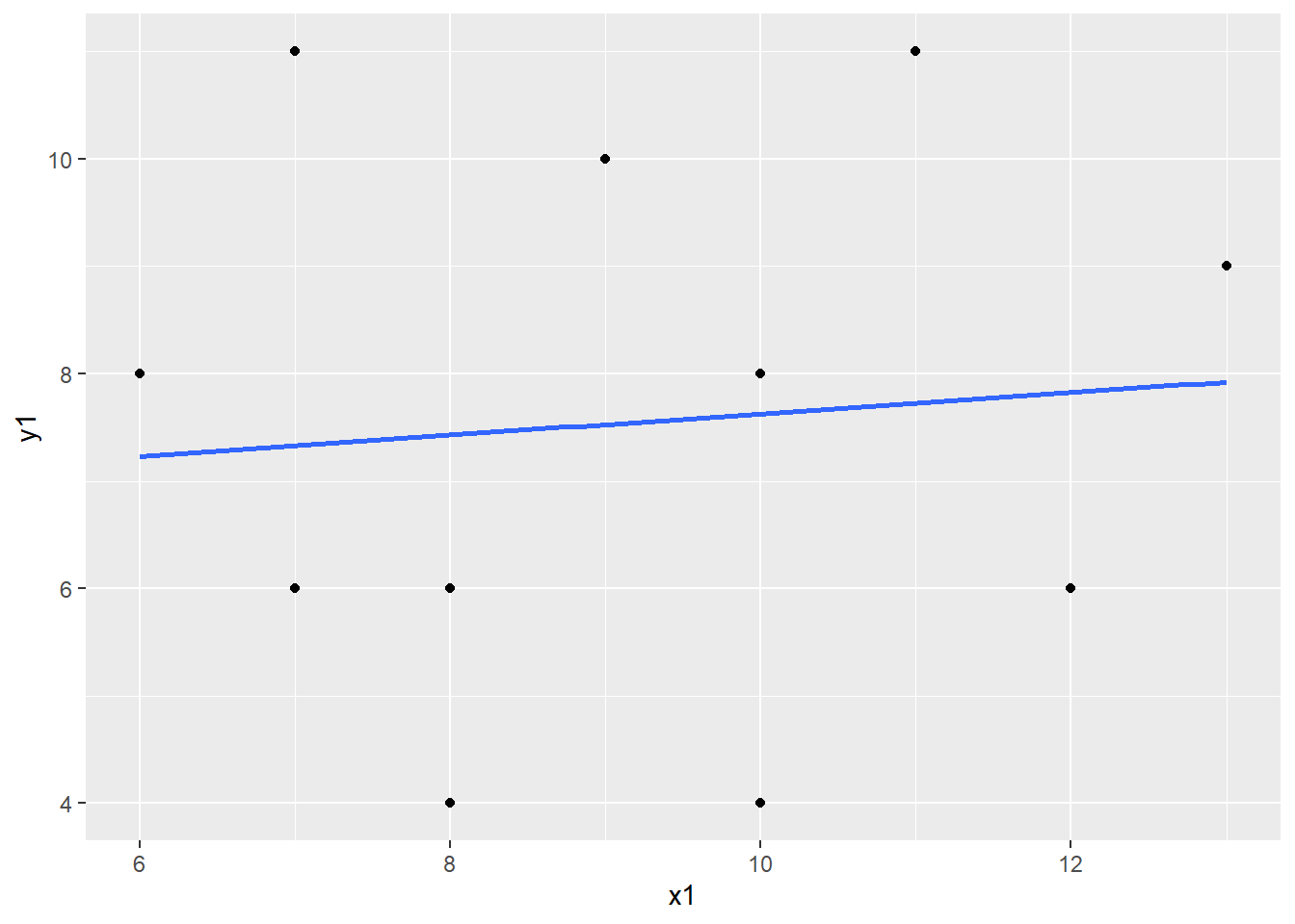
The correlation between X and Y is equal to .6655021, which indicates a fairly strong relationship between the variables. But let’s take a look at the scatterplot to confirm.
Now create a scatterplot of X and Y:
plot_inflated <- ggplot(inflated, aes(x=x1, y = y1)) +
  geom_point() +
  geom_smooth(method="lm", se=0)
plot_inflated
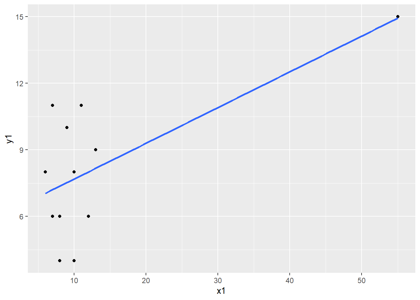
What do you observe? There appears to be an extreme value. Let’s confirm it is extreme by calculating z-scores using the scale function.
inflated <- inflated %>%
  mutate(z_x1 = scale(x1),
         z_y1 = scale(y1))
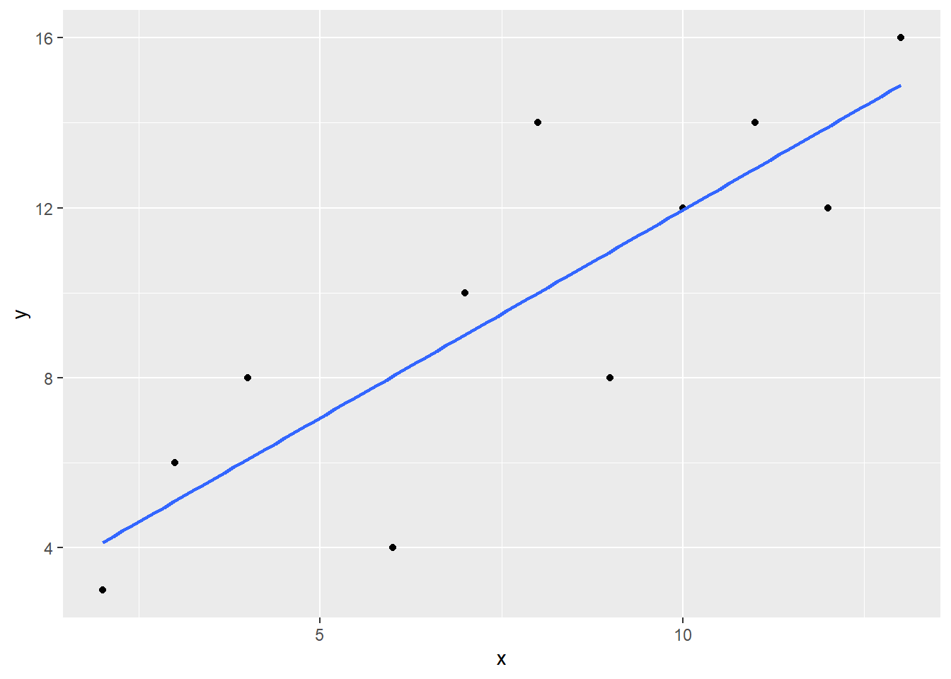
Click on the dataset in your Environment to view it. We can see that the extreme value we observed in the scaterplot is more than 3 SDs from the mean. Remove the extreme case from the dataset and re-run the correlation and the scatterplot.
inflated_noout <- inflated %>%
  filter(z_x1 <= 3)

cor(inflated_noout)
##              x1         y1       z_x1       z_y1
## x1   1.00000000 0.08660789 1.00000000 0.08660789
## y1   0.08660789 1.00000000 0.08660789 1.00000000
## z_x1 1.00000000 0.08660789 1.00000000 0.08660789
## z_y1 0.08660789 1.00000000 0.08660789 1.00000000
plot_inflated_noout <- ggplot(inflated_noout, aes(x=x1, y = y1)) +
  geom_point() +
  geom_smooth(method="lm", se=0)
plot_inflated_noout
- What happend to the correlation coefficient once you removed the outlier?
Deflated Correlation
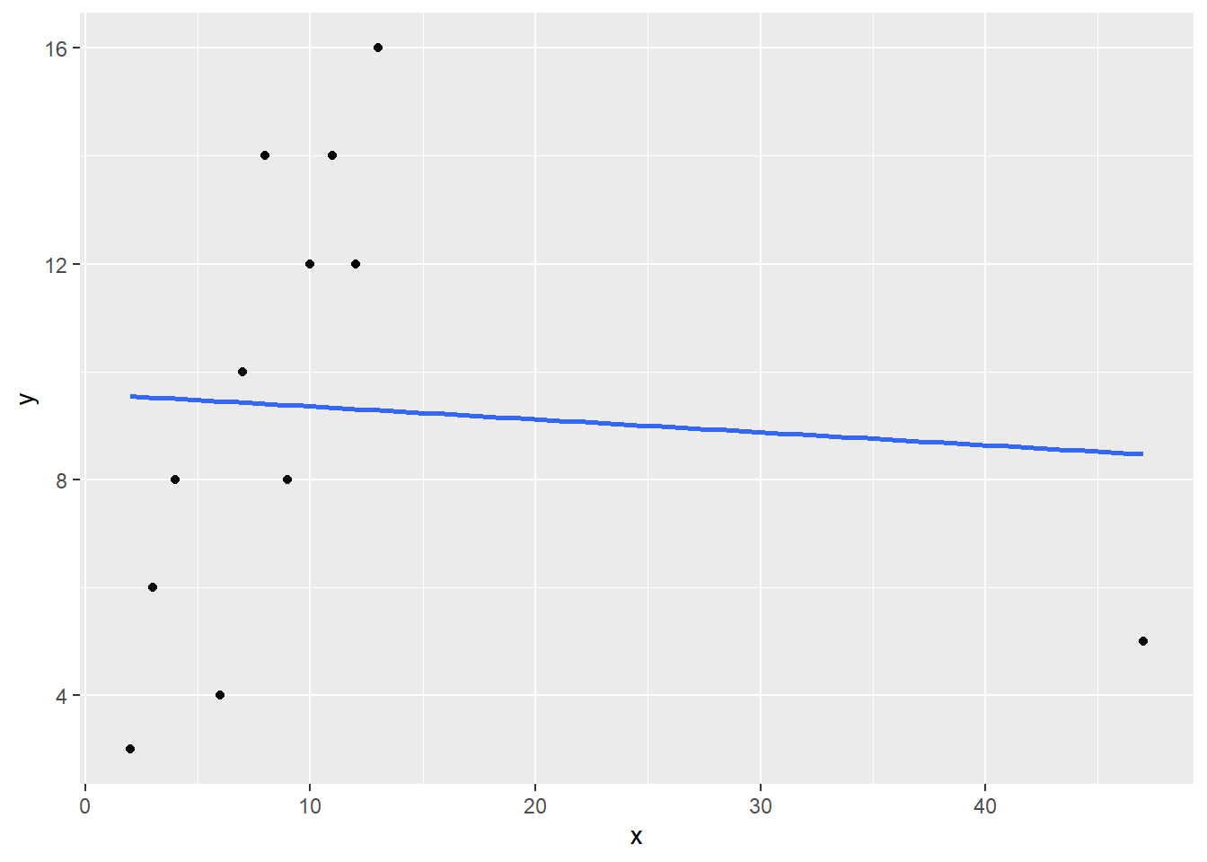
Now let’s turn to the second dataset, deflate. Run through the same procedures you used above: First run the correlation, the create a scatterplot. Identify any extreme cases and confirm with z-scores. Remove the extreme value(s) and then re-run the correlation.
#run the correlation
cor(deflated)
##             x           y
## x  1.00000000 -0.06569197
## y -0.06569197  1.00000000
#scatterplot
plot_deflated <- ggplot(deflated, aes(x=x, y = y)) +
  geom_point() +
  geom_smooth(method="lm", se=0)
plot_deflated
#z-scores
deflated <- deflated %>%
  mutate(z_x = scale(x),
         z_y = scale(y))

#remove outlier
deflated_noout <- deflated %>%
  filter(z_x <= 3)

cor(deflated_noout)
##             x         y       z_x       z_y
## x   1.0000000 0.8409342 1.0000000 0.8409342
## y   0.8409342 1.0000000 0.8409342 1.0000000
## z_x 1.0000000 0.8409342 1.0000000 0.8409342
## z_y 0.8409342 1.0000000 0.8409342 1.0000000
plot_deflated_noout <- ggplot(deflated_noout, aes(x=x, y = y)) +
  geom_point() +
  geom_smooth(method="lm", se=0)
plot_deflated_noout
- What happend to the correlation coefficient in the deflated example?
Non-Parametric Correlations
The code for running non-parametric correlations is very similar to code for pearson’s r. It is just a matter of setting the method or type (depending on the functioning you are using) to Spearman or Kendall. Remember that these types of correlations are appropriate when you have data that do not meet the assumptions of a parametric test, i.e., ranked data.
Download and load the Field liar.csv dataset (available HERE) and then practice running Spearman’s Rho (liar.dat contains data to answer the question of whether people who are creative are better liars. The two variables we are interested in are Creativity (score on a creativity questionnaire) and Position (what place they came in during a Biggest Liar competition).
liar <- read.csv("liar.csv", fileEncoding = "UTF-8-BOM")
Spearman’s Rho
cor.test(liar$Position, liar$Creativity, method = "spearman")
##
## 	Spearman's rank correlation rho
##
## data:  x and y
## S = 71948, p-value = 0.00172
## alternative hypothesis: true rho is not equal to 0
## sample estimates:
##        rho
## -0.3732184
Kendall’s Tau
cor.test(liar$Position, liar$Creativity, method = "kendall")
##
## 	Kendall's rank correlation tau
##
## data:  x and y
## z = -3.2252, p-value = 0.001259
## alternative hypothesis: true tau is not equal to 0
## sample estimates:
##        tau
## -0.3002413
Partial and Semi-Partial Correlations
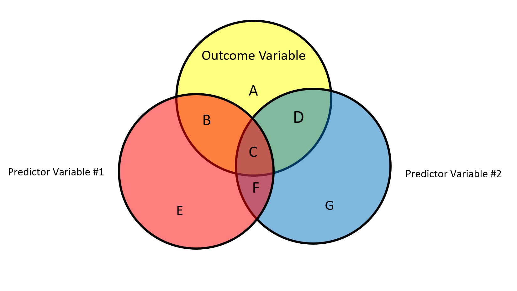
The Venn diagram above contains a graphical representation of the relationships between two predictors and an an outcome variable. The circles represent the total variability of each variable. Each “chunk” of variability is labeled with a letter, A to G.
- The total variability of Y (outcome variable) can be represented as A + B + C + D
- The total variability of X1 is equal to B + C + E + F
- The total variability of X2 is equal to C + D + F + G
What does each individual letter represent?
A: Unexplained variability in Y
B: Unique variability X1 accounts for in Y
C: Shared variability between X1 and X2 in Y
D: Unique variability X2 accounts for in Y
E: Unexplained variability in X1
F: Shared variability between X1 and X2 controlling for Y
G: Unexplained variability in X2
Remember that
Partial correlation (squared)
A partial correlation is a correlation between two variables with the effects of other variables taken into account (“controlled for”). It is the amount of variability in the outcome that a predictor variable shares relative to the amount in the outcome variable that is left after the contributions of the other predictor variables have been removed from both that of the predictor and the outcome. The effects of other variables are “partialed out”. Squared partial correlation is expressed as
Using the Venn Diagram above, the partial correlation between X1 and Y is equal to:
The partial correlation between X2 and Y is equal to:
Semi-partial correlation
Semi-partial correlation is when the effect of a variable is removed from one of the variables but not both variables in the correlation. It is equal to the proportion of variability account for by one predictor but not with any other predictors.
The semi-partial correlation between X1 and Y is:
The semi-partial correlation between X2 and Y is:
Calculating Partial and Semi-Partial Correlations in R
To calculate the partial and semi-partial correlations in R, install the ppcor package. Then use the exam.data2 dataset we created earlier to run partial and semi-partial correlations on the three variables in the dataset.
partial correlation:
pcor(exam.data2, method="pearson")
## $estimate
##             Revise       Exam    Anxiety
## Revise   1.0000000  0.1326783 -0.6485301
## Exam     0.1326783  1.0000000 -0.2466658
## Anxiety -0.6485301 -0.2466658  1.0000000
##
## $p.value
##               Revise       Exam      Anxiety
## Revise  0.000000e+00 0.18373076 1.708019e-13
## Exam    1.837308e-01 0.00000000 1.244581e-02
## Anxiety 1.708019e-13 0.01244581 0.000000e+00
##
## $statistic
##            Revise      Exam   Anxiety
## Revise   0.000000  1.338617 -8.519961
## Exam     1.338617  0.000000 -2.545307
## Anxiety -8.519961 -2.545307  0.000000
##
## $n
## [1] 103
##
## $gp
## [1] 1
##
## $method
## [1] "pearson"
semi-partial correlation:
spcor(exam.data2, method = "pearson")
## $estimate
##             Revise        Exam    Anxiety
## Revise   1.0000000  0.09353257 -0.5953113
## Exam     0.1190801  1.00000000 -0.2264243
## Anxiety -0.5820625 -0.17388899  1.0000000
##
## $p.value
##               Revise       Exam      Anxiety
## Revise  0.000000e+00 0.34976649 4.139928e-11
## Exam    2.332319e-01 0.00000000 2.211450e-02
## Anxiety 1.395349e-10 0.08048295 0.000000e+00
##
## $statistic
##            Revise      Exam   Anxiety
## Revise   0.000000  0.939444 -7.409022
## Exam     1.199335  0.000000 -2.324616
## Anxiety -7.158171 -1.765791  0.000000
##
## $n
## [1] 103
##
## $gp
## [1] 1
##
## $method
## [1] "pearson"
Comparing Correlations
One question that may have occured to you as we have worked through running these correlations is: How do we compare two correlations? How can we tell if two correlations are significantly different from one another? To compare correlations, install the cocor package. You then need to determine if you have independent or dependent correlations. Independent correlations involve separate groups of people, but are on the same variables. Dependent correlations are from the same people, but are different variables (overlapping or not).
Independent correlations
For independent correlations, we will return to the liar dataset. We want to know if the correlation between creativity and position is different for veterans versus first-timers. You’ll need to split the data by group and then put it back together as a list. Then you can use cocor to compare the correlations.
first_timer <- liar %>%
  subset(Novice == 0)

veteran <- liar %>%
  subset(Novice == 1)

list_liar <- list(first_timer,veteran)

cocor(~ Creativity + Position | Creativity + Position,
      data = list_liar)
##
##   Results of a comparison of two correlations based on independent groups
##
## Comparison between r1.jk (Creativity, Position) = -0.2123 and r2.hm (Creativity, Position) = -0.3802
## Difference: r1.jk - r2.hm = 0.1679
## Data: list_liar: j = Creativity, k = Position, h = Creativity, m = Position
## Group sizes: n1 = 33, n2 = 35
## Null hypothesis: r1.jk is equal to r2.hm
## Alternative hypothesis: r1.jk is not equal to r2.hm (two-sided)
## Alpha: 0.05
##
## fisher1925: Fisher's z (1925)
##   z = 0.7268, p-value = 0.4673
##   Null hypothesis retained
##
## zou2007: Zou's (2007) confidence interval
##   95% confidence interval for r1.jk - r2.hm: -0.2792 0.6027
##   Null hypothesis retained (Interval includes 0)
Dependent correlations
For dependent correlations, we want to compare two correlations that involve the same set of people. For example, say we are interested in whether the correlation betwen exam grades and revisions is significantly smaller or larger than the correlation between exam grades and anxiety. In this case, the same people are involved in both correlations. We can use cocor to compare the correlations. However, we do not need to go to the trouble of splitting the data or converting to a list.
exam.data2 <- as.data.frame(exam.data2)
cocor(~ Revise + Exam |Exam + Anxiety, data=exam.data2)
##
##   Results of a comparison of two overlapping correlations based on dependent groups
##
## Comparison between r.jk (Exam, Revise) = 0.3967 and r.jh (Exam, Anxiety) = -0.441
## Difference: r.jk - r.jh = 0.8377
## Related correlation: r.kh = -0.7092
## Data: exam.data2: j = Exam, k = Revise, h = Anxiety
## Group size: n = 103
## Null hypothesis: r.jk is equal to r.jh
## Alternative hypothesis: r.jk is not equal to r.jh (two-sided)
## Alpha: 0.05
##
## pearson1898: Pearson and Filon's z (1898)
##   z = 5.6643, p-value = 0.0000
##   Null hypothesis rejected
##
## hotelling1940: Hotelling's t (1940)
##   t = 5.0933, df = 100, p-value = 0.0000
##   Null hypothesis rejected
##
## williams1959: Williams' t (1959)
##   t = 5.0855, df = 100, p-value = 0.0000
##   Null hypothesis rejected
##
## olkin1967: Olkin's z (1967)
##   z = 5.6643, p-value = 0.0000
##   Null hypothesis rejected
##
## dunn1969: Dunn and Clark's z (1969)
##   z = 4.9043, p-value = 0.0000
##   Null hypothesis rejected
##
## hendrickson1970: Hendrickson, Stanley, and Hills' (1970) modification of Williams' t (1959)
##   t = 5.0657, df = 100, p-value = 0.0000
##   Null hypothesis rejected
##
## steiger1980: Steiger's (1980) modification of Dunn and Clark's z (1969) using average correlations
##   z = 4.8308, p-value = 0.0000
##   Null hypothesis rejected
##
## meng1992: Meng, Rosenthal, and Rubin's z (1992)
##   z = 4.8310, p-value = 0.0000
##   Null hypothesis rejected
##   95% confidence interval for r.jk - r.jh: 0.5308 1.2556
##   Null hypothesis rejected (Interval does not include 0)
##
## hittner2003: Hittner, May, and Silver's (2003) modification of Dunn and Clark's z (1969) using a backtransformed average Fisher's (1921) Z procedure
##   z = 4.8308, p-value = 0.0000
##   Null hypothesis rejected
##
## zou2007: Zou's (2007) confidence interval
##   95% confidence interval for r.jk - r.jh: 0.5217 1.1064
##   Null hypothesis rejected (Interval does not include 0)